Define
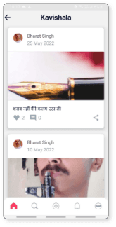
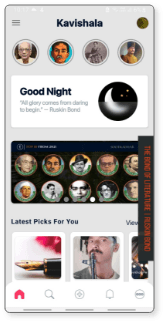
While the app’s user flow has been made very basic to accomadate the non tech-savvy individuals it’s obsolete and primitive UI has made it boring. Thus, making the overall user experience feel lackluster. The heavy use of drop shadows, rounded rectangle, and illegible typeface are hampering the user experience. The audience has been exposed to apps like Behance, Instagram and Snapchat and expect similar features. The app primarily has written content and therefore requires some visuals to balance out.
Are you satisfied with the color palette of the application?
Survey Results
No
Yes
Were the size of the app controls big enough?
59%
41%
Were the characters on the screen difficult to read?
No
Sometimes
75%
60%
59%
25%
35%
41%
Yes
15%
How likely are you to recommend our app to someone?
Likely
Unlikely
65%
35%
Which part of the app needs more focus?
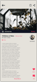
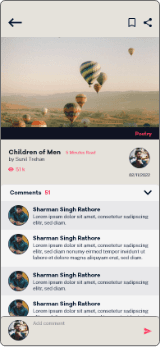
Feed
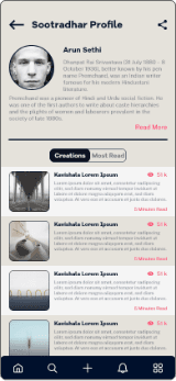
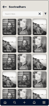
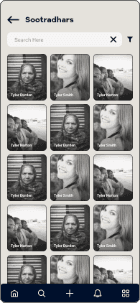
Sootradhars
Homepage
55%
25%
20%
Rate our app’s content clarity
3.85/5
Rate our app’s attractiveness
2.8/5
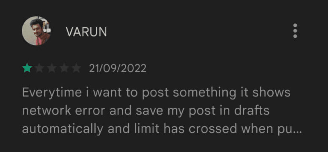
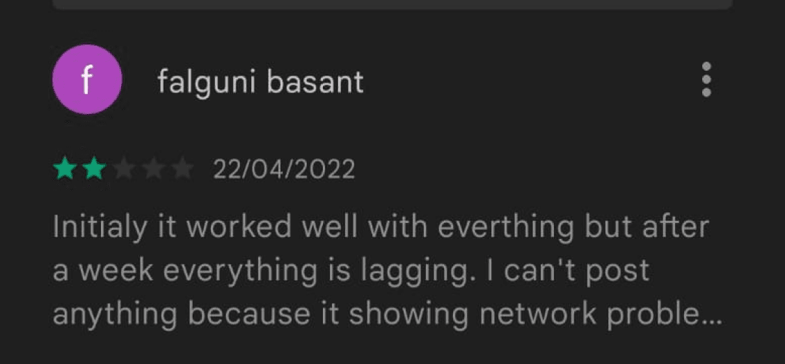
The reviews and feedback from google play store and email were also analysed to understand the user’s pain-points and frustrations.
Secondary Research
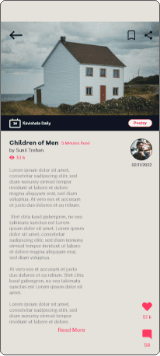
• Feed section has been overlooked. It needs more work in terms of information organization and layout
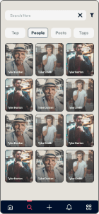
• Include feature from popular social media apps like Instagram. Could include double-tap, stories, tags etc.
• The brand could have a distinct illustration style that could be applied throughout the website
• Neutral colors or Pastels are preferred for app's color palette
• Body text is readable but the headings could use a different typeface.
• Some of the most asked features were Dark Mode, Audio book, DM service, Creating rooms, Trending topics/poems/writers, predesigned quotes to share on WhatsApp.
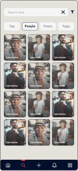
• Images are hard to understand especially the ones used in the carousel
• Include feature from popular social media apps like Instagram. Could include double-tap, stories, tags etc.
• The brand could have a distinct illustration style that could be applied throughout the website
• Neutral colors or Pastels are preferred for app's color palette
• Body text is readable but the headings could use a different typeface.
• Some of the most asked features were Dark Mode, Audio book, DM service, Creating rooms, Trending topics/poems/writers, predesigned quotes to share on WhatsApp.
• Images are hard to understand especially the ones used in the carousel
Research Insights
Discover
The questions focused primarily on the UI of the brand's website and mobile application. It included questions about the images, typeface, color palette and other UI related areas.
The insights would help us enhance the overall UI of the website and app to provide the current users with better experience as well as attract new audience by increasing the brand reach.
The changes would not be limited only to the website and the app of the brand but could also be applied on the brand's Instagram and other social media handles as well as it's other products and services.
Primary Research
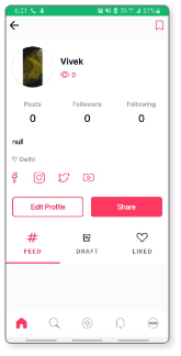
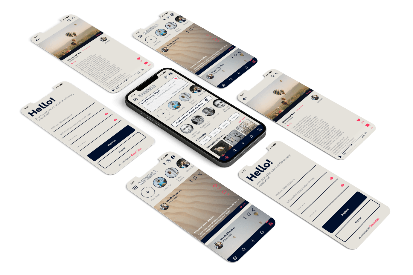
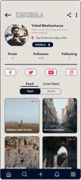
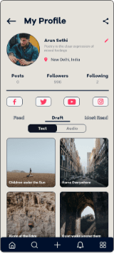
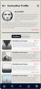
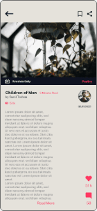
Redesign the mobile application to enhance user experience and improve the overall UI of the app. Highlight the services provided by the brand and focus primarily on the feed section and user generated content. Conduct primary research to find the problems faced by the user while using the current application
Kavishala Application Redesign
Kavishala
Company
Internship
Type of Project
UX/UI Designer
Role
5 Weeks
Timeline


Vivek Chauhan, All Rights Reserved
2022 Portfolio
The Design Process
Prototype
Ideate
Define
Discover
Test
Typefaces
ABCDEFGHIJKLMNOPQRSTUVWXYZabcdefghijklmnopqrstuvwxyz
0123456789!@#$%^&*()_+-=[]\;’,./{}|:”<>?
0123456789!@#$%^&*()_+-=[]\;’,./{}|:”<>?
ABCDEFGHIJKLMNOPQRSTUVWXYZabcdefghijklmnopqrstuvwxyz
0123456789!@#$%^&*()_+-=[]\;’,./{}|:”<>?
0123456789!@#$%^&*()_+-=[]\;’,./{}|:”<>?
Public Sans Light
Public Sans Regular
ABCDEFGHIJKLMNOPQRSTUVWXYZabcdefghijklmnopqrstuvwxyz
0123456789!@#$%^&*()_+-=[]\;’,./{}|:”<>?
0123456789!@#$%^&*()_+-=[]\;’,./{}|:”<>?
Public Sans Bold
ABCDEFGHIJKLMNOPQRSTUVWXYZabcdefghijklmnopqrstuvwxyz
0123456789!@#$&*()_+-[]\;’,./{}:”?
0123456789!@#$&*()_+-[]\;’,./{}:”?
Galano Grotesque
Prototyping
Low Fidelity Wireframes
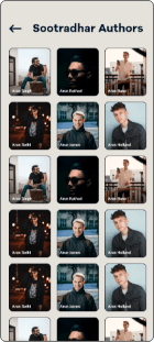
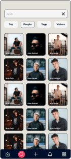
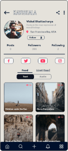
High Fidelity Wireframes A


High Fidelity Wireframes B
Style Guide
#F5F5F5
#E5E2DB
#00102C
#00102C 50%
#FF3861
Colour Palette
Iconography
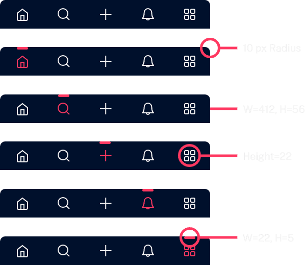
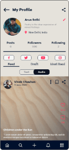
Bottom Navigation Bar
Ideation
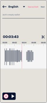
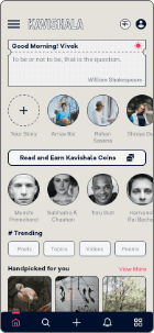
Audiobooks
Following are some of ideas we had for the app
Messaging Services
Audio Assistants
Stories like Instagrams
Trending Poets, Topics etc.
The following ideas and features were approved and a few ideas were shelved due to the lack of resources
Increase Customization in posts
Audio Posts
Profile Customization
Audio Posts
Profile Customization
Increase Customization in posts
Trending Poets, Topics etc.
Stories like Instagrams
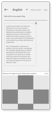
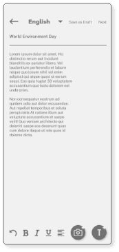
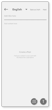
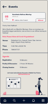
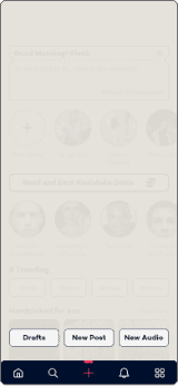
User Flow
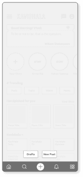
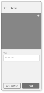
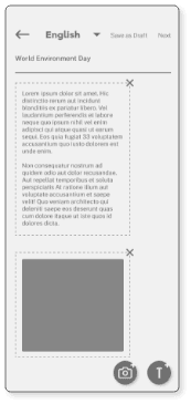
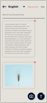
Creation Page
Enter Details
Choose
Drafts/ Next/
No
Post Preview
Choose
Drafts/ Next/
No
Additional Info
Choose
Drafts/ Post/
No
Drafts/ Post/
No
START
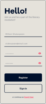
Sign in
Sign in
Y/N
Y/N
Enter Details
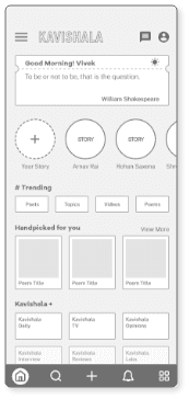
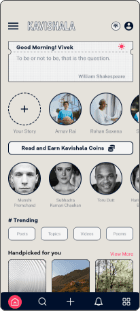
Homepage
Add Page
Select Post
Y/N
Y/N
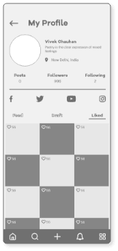
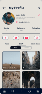
My Profile Draft
My Profile Posts
Post Uploaded
No
No
No
No
No
Drafts
Drafts
Drafts
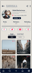
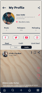
Signing in, creating and uploading a post
END
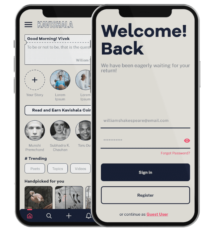
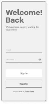
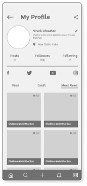
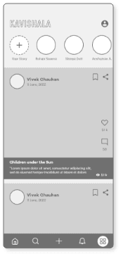
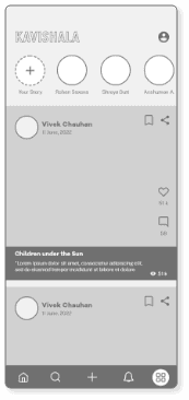
A/B Testing
Testing

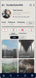
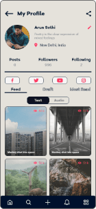
Screen A
Screen B
70%
30%
Screen B were preferred by the users and employees of the brand. Bottom navigation bar, and component size and spacing were some of the features of Screen B that were preferred over Screen A.
After making slight adjustments the design was approved by the director and is being actively developed.
Reflection
This was the first time that I worked on an industry project in UX/UI design. I was able to apply my learnings from my academic projects and modules and was glad when the team appreciated the design process that I was following. One thing that I learned from this project and applied to all my future projects during my time at the company was to be considerate of the developers. So, I started using simple design and components to reduce the burden the on them. I understood the value of following the process and taking feedbacks. The only thing missing from the experience was a senior UX/UI designer who could mentor me.